SQLITE NOT INSTALLED
Mixing and matching styles isn’t about chaos or fashion shows where nothing makes sense. It’s a creative practice that, when done with intention, produces environments, outfits, and visuals that feel alive and personal. Whether you’re blending mid-century furniture with modern lighting, pairing sporty sneakers with a tailored coat, or layering retro graphics into a contemporary brand, the goal is the same: create harmony from contrast.
This article walks you through the principles, the practical steps, and the little tricks that make style mixing work. You’ll find clear advice for different arenas—fashion, interiors, graphics, events—plus checklists, tables of combinations, and troubleshooting tactics you can use right away. Read on, and you’ll learn how to make different styles play nice without losing personality.
Why Mixing Styles Matters
At its best, style mixing expresses individuality. It shows that you’ve looked around, chosen deliberately, and composed something that reflects taste rather than trend-following. People connect with spaces and outfits that tell stories; layered styles do exactly that. They reveal histories, preferences, and a willingness to experiment.
Beyond aesthetics, mixing styles is practical. Combining elements from different eras or genres can solve functional problems—introducing modern lighting into a classic room for better illumination, or adding performance fabrics to vintage silhouettes to make them wearable in daily life. Cross-pollination increases the utility and longevity of the objects and garments we own.
Finally, blending styles encourages creativity. It requires noticing proportions, textures, and color relationships. It demands decisions. That mental engagement sharpens taste and makes future choices easier. You begin to see patterns—what anchors a look, what toggles it from casual to formal, what respects cultural context—and you build confidence in curating your own visual vocabulary.
Core Principles of Successful Style Mixing
a44590c8ca6f96b59f796b47ad7e1990.jpg
Balance and Hierarchy
Balance is the unseen architecture of any composition. If one element shouts while the rest whisper, the overall impression is lopsided. Hierarchy means deciding which piece is the star and which are supporting actors. In fashion, a statement coat might be the star; in a living room, a large sofa or an eye-catching rug often fills that role. Once you assign hierarchy, arrange other elements to complement rather than compete.
Balance also operates on scale: a petite side table beside a massive sectional will feel awkward unless you introduce intermediary elements that bridge the gap—like mid-height lighting or a stack of books that add vertical rhythm. Seek relationships between objects so your eye moves through the space or outfit naturally.
Color and Palette
Color is the fastest way to unify disparate items. Even wildly different styles can feel cohesive when they share a color story. Start with a base color—neutral or bold—and add two to three accent colors. Use repeats: a small accessory in the same hue as a large piece ties the look together. When uncertain, restrict your palette; richness comes from texture and shape as much as from color complexity.
Neutrals are not boring when used well. Warm neutrals (beige, camel, warm gray) read differently from cool neutrals (charcoal, slate, off-white). Mixing metals and finishes creates depth within the palette. An antique brass sconce, matte black hardware, and polished chrome kitchen fixtures can coexist if you intentionally distribute them across the room so one finish doesn’t dominate the visual field.
Texture and Material Contrast
Texture gives depth. Pairing glossy with matte, sleek with nubby, smooth with ribbed can be more compelling than clashing styles. Leather’s sheen beside raw linen, polished glass on a reclaimed wood table, or satin shoes with a wool suit—these contrasts create tactile interest that draws you in.
Think in layers of touch: hard surfaces (stone, metal), soft furnishings (wool, velvet), and small accessories (ceramics, glass). A successful mix usually includes at least three distinct material groups to prevent flatness. Introducing unexpected textiles—a rug with a rough weave under a modern acrylic table, for example—adds nuance and anchors disparate elements.
Scale, Proportion, and Rhythm
Scale is not just size; it’s how big something feels relative to its surroundings. Proportion is the relationship between parts. Rhythm is the repetition or variation that guides the eye. Combine these deliberately. Use repetition of shape or color at different scales to create rhythm: a circular mirror, round coffee table, and small round tray create a cohesive language even if each piece comes from a different stylistic tradition.
Pay attention to negative space. Crowding items because they’re “cool” breaks rhythm and prevents each piece from contributing to the whole. Give important pieces room to breathe and let smaller elements cluster to form visual punctuation.
Intentional Focal Points
Every composition benefits from focus. Identify an anchoring element early—an art piece, a structural architectural detail, an heirloom coat—and arrange other pieces to highlight it. The focal point can be bold or subtle, but it should be deliberate. Without it, mixed styles can feel directionless.
Focal points also serve as emotional centers. In a home, a fireplace draws people; in fashion, a necklace can anchor an ensemble. In graphic design, it might be a striking headline or an unexpected illustration. Build toward the focal point; let other elements support it like a frame supports a portrait.
Practical Step-by-Step: How to Mix and Match
Step 1 — Define Your Intent
Start by asking what you want to achieve. Is this a cozy living room that nods to modernity while keeping family heirlooms? A wardrobe that blends athletic comfort with polished tailoring? An event that feels festive but not costumey? Define the mood and function first. That clarity filters choices later and prevents decisions that look impressive but don’t work.
Step 2 — Choose Anchors
Pick one or two anchor pieces that define the space or outfit. In a room, anchors are large furniture or built-in features. In fashion, anchors are garments like a coat, dress, or trousers. Anchors set scale and tone—everything else should relate to them. If you’re uncertain, pick neutral anchors and let accents introduce stronger stylistic cues.
Step 3 — Build a Color Story
Once anchors are chosen, create a simple palette. Use a 60/30/10 rule if you like: 60% base color, 30% secondary color, 10% accent. Translate these percentages to surface area: walls, large furniture, and floors usually occupy the 60%. Secondary colors appear on sofas, curtains, or big garments. Accents are accessories, pillows, belts, shoes, or small décor items. This keeps variety from becoming disorder.
Step 4 — Introduce One Contrasting Element
Choose one item that intentionally contrasts with the anchors—a vintage chair in a contemporary room, a dress with sneakers, a serif headline in a sans-serif layout. This contrast creates interest. Avoid adding multiple opposing statements at once; let one unexpected piece be the conversation starter.
Step 5 — Add Texture Layers
Introduce at least three textures across the composition. For a room, that might be a velvet sofa, a wool rug, and a metal lamp. For clothing, think cotton shirt, leather jacket, silk scarf. In branding, combine flat color blocks, textured paper, and glossy photo imagery. Layering textures makes different styles feel integrated rather than stitched together.
Step 6 — Edit Ruthlessly
Resist the temptation to keep adding. Get to a point where every item earns its place. Remove pieces that compete with the focal point or muddle the vocabulary. Editing simplifies the visual story and elevates quality over quantity.
Step 7 — Test in Context
Look at your mix in real life or mock it up. Walk around the room, try the outfit in different lighting, or print a proof for print design. Context reveals issues that theorizing ignores: color shifts under incandescent light, garments that bunch when layered, or prints that read differently at scale. Make adjustments accordingly.
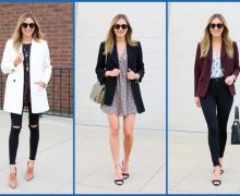
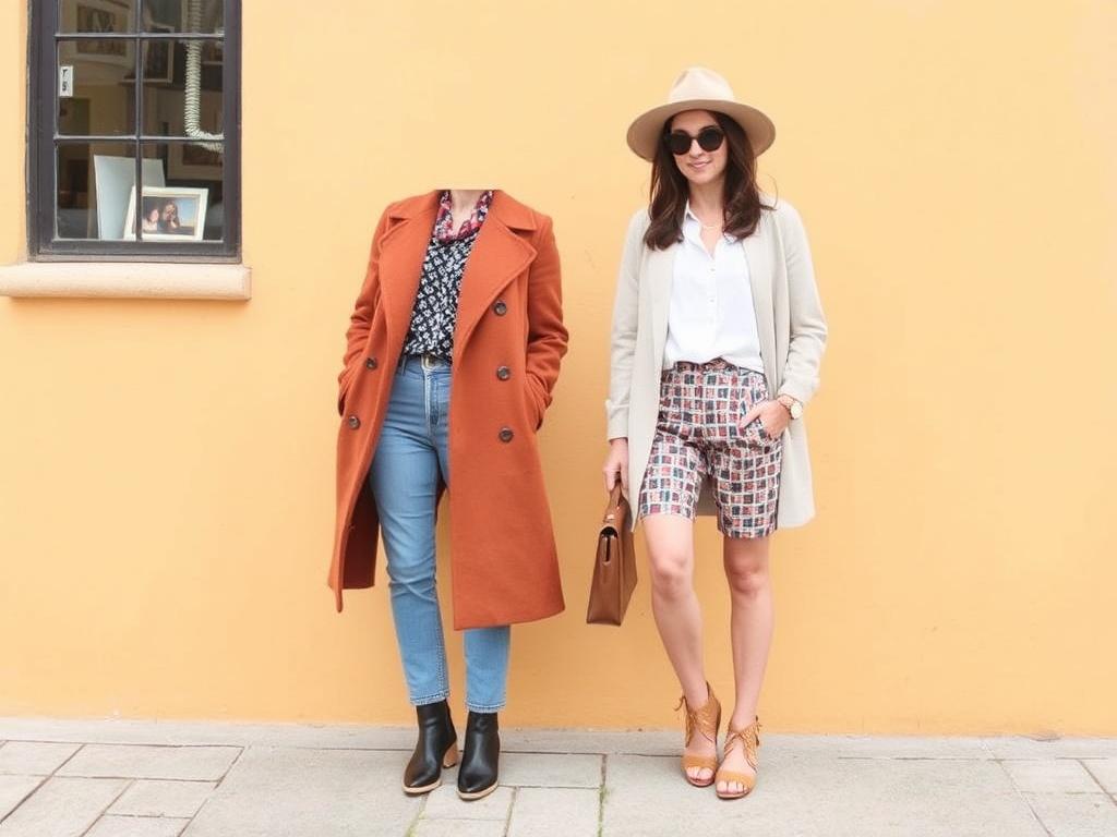
Mixing Styles in Fashion
Capsule Wardrobe: Start Small, Mix Wildly
A capsule wardrobe is a strategic way to explore mixing styles. Keep a small set of neutral anchors—tailored trousers, a classic coat, a white shirt—and rotate more adventurous pieces around them: vintage tees, contemporary sneakers, bohemian scarves. The anchors provide structure, while accents let you express mood without an overstuffed closet.
Capsules also reveal what combinations work on you. Wear archived pieces in new pairings to discover unexpected favorites. Over time you’ll assemble go-to contrasts that feel uniquely yours.
Workwear Meets Weekend: Blurring Lines
Blending professional and casual pieces creates comfortable sophistication. Pair a structured blazer with relaxed denim and sneakers, or a crisp dress shirt with tailored joggers and loafers. The trick is to keep at least one element polished—sharp tailoring, high-quality fabric, or a refined accessory—so the ensemble reads intentional.
Accessories are powerful here: a leather belt, fine watch, or silk scarf can make casual garments feel composed. Conversely, a beanie or crossbody bag can tone down very formal pieces for day-to-day life.
Layering and Proportion in Clothing
Layering lets you mix silhouettes and textures. Combine long and short lengths—an oversized cardigan over a fitted dress, a cropped jacket atop a long tunic. Balance is important: if your top layer is voluminous, keep the bottom streamlined. Proportion prevents the “weighted” look and ensures movement remains effortless.
Also think about negative space: leaving a hint of the shirt hem exposed or allowing a scarf to hang loosely adds visual breaks that prevent heaviness. Small exposures of line and color can transform a heavy mix into something airy.
Shoes and Accessories: The Tie That Binds
Shoes often define the tone: boots make an outfit rugged, loafers elevate it, sneakers render it relaxed. Use them deliberately. Accessories—belts, bags, hats, jewelry—act as punctuation marks. A vintage brooch on a modern blazer, a luxury watch with a casual sweater, or statement socks with a tailored suit can be the connective tissue that binds disparate pieces.
Mixing Styles in Home Decor

Room-by-Room Strategies
Living Room: Start with a dominant piece—sofa or rug. Use art, lighting, and small furniture to bridge styles. If the sofa is modern, add a vintage wooden coffee table and contemporary lamps. Keep large surfaces simple and use accessories to add character.
Bedroom: Bedrooms benefit from softness. Pair a classic bed frame with eclectic bedside lamps or modern bedding with an antique dresser. Use textiles—blankets, cushions, rugs—to rotate seasonal styles without expensive changes.
Kitchen: Kitchens can be a study in practical mixing. Combine painted cabinets with industrial hardware, or reclaimed wood shelves with modern appliances. Open shelving showcases curated items that bring personality into functional space.
Combining Period Pieces
Mixing furniture from different periods—Victorian, mid-century, and contemporary—works when you repeat elements like shape or color. For example, echo curved lines: a rounded mid-century sofa with an ornate mirror softens contrasts. Repeat materials (wood tones, brass) across periods to form a subtle throughline.
When introducing antiques, give them prominence and let modern objects act as breathers. Antiques often carry visual weight; placing them near lighter, modern pieces prevents the room from feeling pieced together without cohesion.
Textiles as Style Chameleons
Textiles are the easiest way to pivot a room’s voice. Swap curtains, layer rugs, or change cushion covers to shift from boho to minimalist or from rustic to polished. Because textiles are relatively affordable and simple to replace, they’re ideal for experimenting. A patterned kilim rug grounds an eclectic mix; a monochrome rug streamlines it.
Lighting: The Unspoken Designer
Lighting changes everything. A modern pendant can make an antique table read contemporary. Warm, dimmable lights cozy up modern interiors; crisp, cool lighting clarifies ornate details in classical rooms. Use multiple levels—ambient, task, accent—to create dimension and draw attention to your focal points.
Mixing Styles in Graphic Design and Branding
Visual Hierarchy and Type Mixing
Combining fonts is a classic way to mix styles in design. Pair a serif and sans-serif to balance tradition with modernity. Use contrast in weight, size, and color to establish hierarchy. Avoid using too many type families; two complementary families usually suffice. Let one family be the voice (headlines), another the supporting narrator (body text).
Think about the emotional tone each font conveys. A condensed geometric sans feels efficient; a hand-drawn script feels personal. Use these voices purposefully—script for warmth, sans for clarity—and make sure they speak to the audience and context.
Imagery and Texture
Mixing photographic realism with illustrative elements can produce compelling layouts. For example, overlay line drawings on photos to add narrative depth. Textured backgrounds (paper grain, fabric) offset flat vector shapes and give tactile sensibility, particularly useful in print where the physical feel aligns with visual cues.
Color Systems and Brand Cohesion
Brands that combine classic and modern cues can use a restrained palette that allows accent colors to express personality. Define primary colors for core messaging and secondary or accent colors for promotions or seasonal campaigns. Consistent application is the glue that keeps diverse stylistic elements readable across platforms.
Spacing and Grids
A robust grid system reconciles varied elements by providing a structural backbone. Whether you’re posting on social media, building a website, or designing packaging, grids ensure alignment and rhythm. They let disparate visuals coexist because they share an invisible order—margins, gutters, and column structures guide placement so variety feels composed.
Mixing Styles for Events and Spaces (Weddings, Parties)
Create a Narrative
Events are storytelling in three dimensions. Choose a narrative—rustic romance, urban chic, retro revival—and let each detail add a chapter. In a wedding, stationery, florals, furniture, and music should all hint at the same story even if they originate from different aesthetics. Consistency in mood, not necessarily period, keeps the event cohesive.
Furniture and Rentals: Curated Eclecticism
Mix rented items intentionally. Pair a few standout vintage chairs with modern tables. Groupings matter: place similar items in groups to read as curated sets rather than random leftovers. Rent items in modulated quantities so the overall vision remains clear.
Signage and Wayfinding
Events require functional graphics that can still be stylish. Combine minimal typography with ornate floral motifs or vice versa. Ensure legibility first; flourish second. A sign that looks beautiful but is unreadable is a failure of design in an event context.
Mixing Cultural Influences Respectfully
Understand Origins and Context
Borrowing from another culture can enrich design, but it must be done thoughtfully. Study the origin, meaning, and significance of motifs, garments, or rituals before using them. Avoid trivializing sacred symbols or treating cultural artifacts as mere decoration.
Consultation matters. If a design heavily references another culture, collaborate with creators from that culture or patrons who understand the context. This isn’t gatekeeping; it’s respectful practice that produces more authentic and interesting outcomes.
Blend, Don’t Reduce
Mixing cultural styles should add nuance, not flatten identity into a single-styled novelty. Keep the integrity of the original elements by pairing them with neutral anchors and explaining their presence when appropriate—through captions, stories, or curated displays. Transparency about sources and inspiration turns borrowing into homage.
Rules to Break—and When to Break Them
The Guideline, Not the Law
Rules—matching metals, sticking to a palette, limiting font families—are tools. They provide safety while you learn. But once you understand why a rule exists, you can break it to create impact. For instance, mixing three or more pattern types can be stunning if they share a unifying color. Breaking rules is most effective when done deliberately and sparingly.
Controlled Disruption
Use disruption as a focal device. If everything in a room is muted and minimal, one exuberant pattern or color becomes more dramatic. The same is true in fashion: pairing a ballroom gown with combat boots disrupts expectations and creates a memorable statement when executed with confidence.
Tools, Resources, and Apps That Help
Digital mood boards are invaluable. Tools like Pinterest, Milanote, or a simple folder of photos let you test combinations before committing. For color work, use Adobe Color or Coolors to generate palettes and explore harmonies. For fashion, try virtual closet apps or outfit planners to experiment with combinations without physically staging them.
In interiors, augmented reality (AR) apps from furniture retailers let you visualize scale and color in situ. For graphic design, Figma and Canva provide easy templates for combining imagery, fonts, and color systems. Use these tools to prototype—then edit ruthlessly after seeing the mix live.
Case Studies and Example Pairings
Here are concrete pairings that work, explained in practical terms. Use them as starting points, not prescriptions.
| Style Pairing | Why It Works | Key Elements | Example |
|---|---|---|---|
| Mid-century Modern + Industrial | Mid-century’s warmth and organic shapes balance the rawness of industrial materials. | Teak wood, tapered legs, exposed metal, Edison bulbs | Teak credenza, black steel shelving, a leather lounge chair, and a concrete pendant |
| Boho + Minimalist | Minimalist structure prevents boho’s textures from feeling chaotic; boho adds warmth. | Neutral base, layered rugs, handcrafted ceramics, single sculptural sofa | White walls, simple sofa, two patterned rugs layered, macramé art, a single plant |
| Tailored + Sporty (Fashion) | Sporty pieces bring comfort to tailoring and make formal items wearable daily. | Blazer, tailored trousers, performance sneakers, tee or hoodie | Single-breasted blazer, slim joggers, crisp white sneakers, minimalist watch |
| Rustic + Scandinavian | Rustic textures (wood, stone) combined with Scandinavian simplicity create cozy refinement. | Light woods, sheepskin throws, matte black accents, simple lines | Exposed beams, pale oak table, wool throw, black pendant lighting |
Each of these examples uses repetition and contrast: repeat a material or color in multiple places and introduce a clear contrast to maintain interest. Apply this framework wherever you mix styles.
Dos and Don’ts: A Practical Cheat Sheet

| Do | Don’t |
|---|---|
| Define a focal point | Scatter too many statement pieces without hierarchy |
| Repeat colors and materials | Introduce random colors that don’t relate to the palette |
| Use textures to create depth | Rely on color alone to resolve tension |
| Edit after assembling | Keep items because they’re “cool” even if they don’t fit |
| Respect cultural sources | Use sacred motifs as mere ornament |
Troubleshooting Common Problems
The Space Feels Disconnected
If different areas of a room feel like separate worlds, unify them with a single unifying element: a rug color that repeats in a pillow pattern, a metal finish that shows up in multiple fixtures, or a recurring shape (like rounds or rectangles). This creates invisible threads that tie the composition together.
Too Busy or Overloaded
Subtract. Remove smaller accessories first and live with the edit for a day. If the space breathes, congratulations—you removed visual noise. If it feels empty, introduce one purposeful piece at a time and reassess. Minimalism can be an elegant answer to mixing gone awry.
Clashing Patterns
Bring patterns into harmony by aligning scale and color. Pair a large-scale floral with a small geometric print that shares one or two colors. If patterns still fight, insert a neutral buffer—a solid pillow or plain area rug—to give each print space to exist.
Outfit Feels Confusing
If your outfit reads mixed without charm, choose one element to be distinctly polished and make others clearly casual. For example, with a distressed denim jacket and a silk dress, make the dress the refined element—keep hair and makeup simple and let the jacket be the playful contrast.
Budget-Friendly Ways to Mix and Match
Style mixing doesn’t require expensive shopping. Thrift stores, estate sales, and online marketplaces are treasure troves of pieces from different eras. Mix affordable modern basics with a single, well-chosen vintage or designer item to elevate the whole look.
DIY can also help: reupholster a thrifted chair in a modern fabric, spray-paint outdated hardware in a new finish, or sew cushion covers from interesting fabric remnants. These small interventions let you customize without breaking the bank.
For wardrobes, learn basic tailoring—hem a dress, take in a shirt—so budget pieces fit like they were made for you. Fit alone changes perceived value more than price does.
Sustainability and Longevity When Mixing Styles
Think long-term. Mixing styles is a sustainable approach because it encourages reuse and adaptability. Heirloom pieces can be updated with modern accents instead of being replaced. Investing in high-quality anchors—sofa, coat, bed—means you can change supporting elements seasonally or annually without waste.
When shopping, prioritize materials and construction. A well-made leather shoe or a solid wood table will last through many style changes. When you part with items, resell, donate, or upcycle. The more circular your approach, the more creative and less disposable your style mixing becomes.
Checklist: Quick Guide to Mixing Styles
- Define mood and function first.
- Pick one or two anchor pieces.
- Create a simple color palette and repeat colors.
- Introduce at least three textures across the space or outfit.
- Choose one intentional contrast for interest.
- Edit ruthlessly—less is often more.
- Test in real-life lighting and context.
- Document combinations that work for future reference.
- Respect cultural sources and consult when needed.
- Opt for sustainability: buy well, reuse often.
Final Thoughts: Making Mixed Styles Feel Like You
Mixing styles isn’t a checklist you finish and forget; it’s an ongoing conversation with your surroundings, wardrobe, or brand. It rewards curiosity and encourages mindful choices. Start small, rely on anchors, and let contrasts tell the story you want to tell.
Most importantly, trust your eye. The rules and guidelines here are scaffolding, not shackles. If something moves you—an old painting, a bold jacket, a typeface that stops you mid-scroll—try to find a way to incorporate it thoughtfully. The joy of mixing styles comes from surprise, discovery, and the quiet satisfaction of seeing diverse elements resolve into a singular voice: yours.